Eye-Con Entertainment

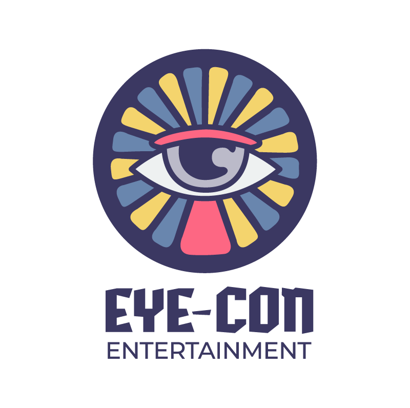
The Eye-Con Entertainment logo was designed for director Hossam L. Hossainy. It’s simple yet bold, meant to stand out while staying clean and professional. The design keeps the original vibe and color palette, but with a fresh, modern twist that reflects the creative vision behind the brand.
Toronto Yacht Tours


The Toronto Yacht Tours logo is a simple and sleek design that captures the elegance of the brand. Clean, modern, and easy to recognize, it reflects the luxury of the experience while staying approachable. I collaborated with Hazel Graham on this project to bring the brand’s vision to life with a polished and professional look.
Brazil Tourism

This logo was created for my Content Management Systems II class, where our task was to develop a fully responsive tourism website optimized for both desktop and mobile devices. We chose a bird as the logo symbol, inspired by the vibrant and diverse birdlife that is iconic to Brazil, reflecting the country’s rich natural beauty and wildlife.
Fresh Bite

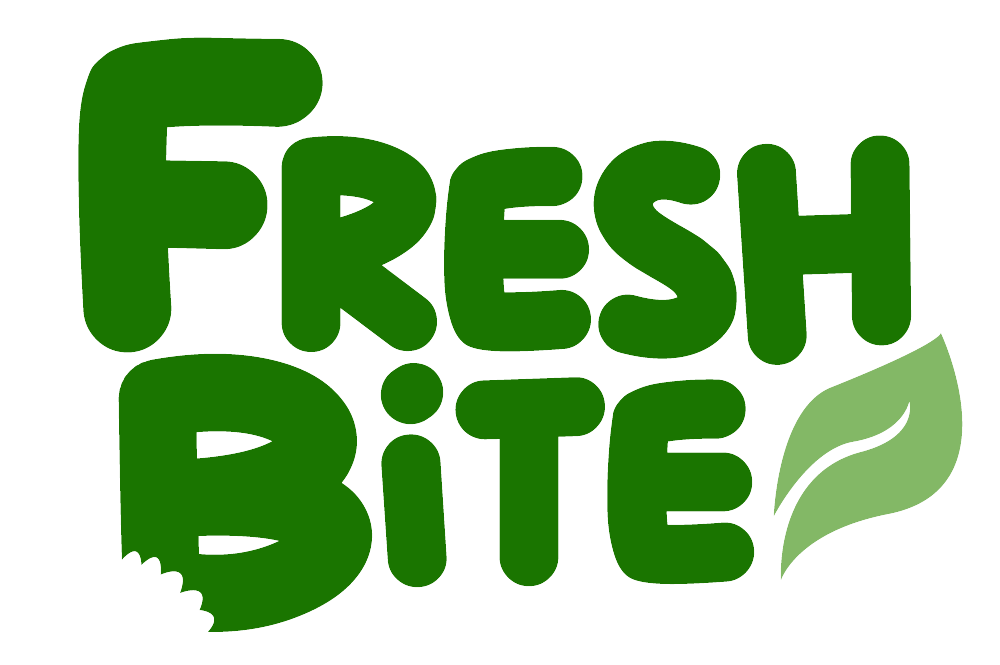
These logos were created as part of my User Experience Design course, where we were challenged to conceptualize and design an original app. Our team developed a healthy food delivery app aimed at providing affordable, nutritious meals delivered directly to users.
Heavenly Hues
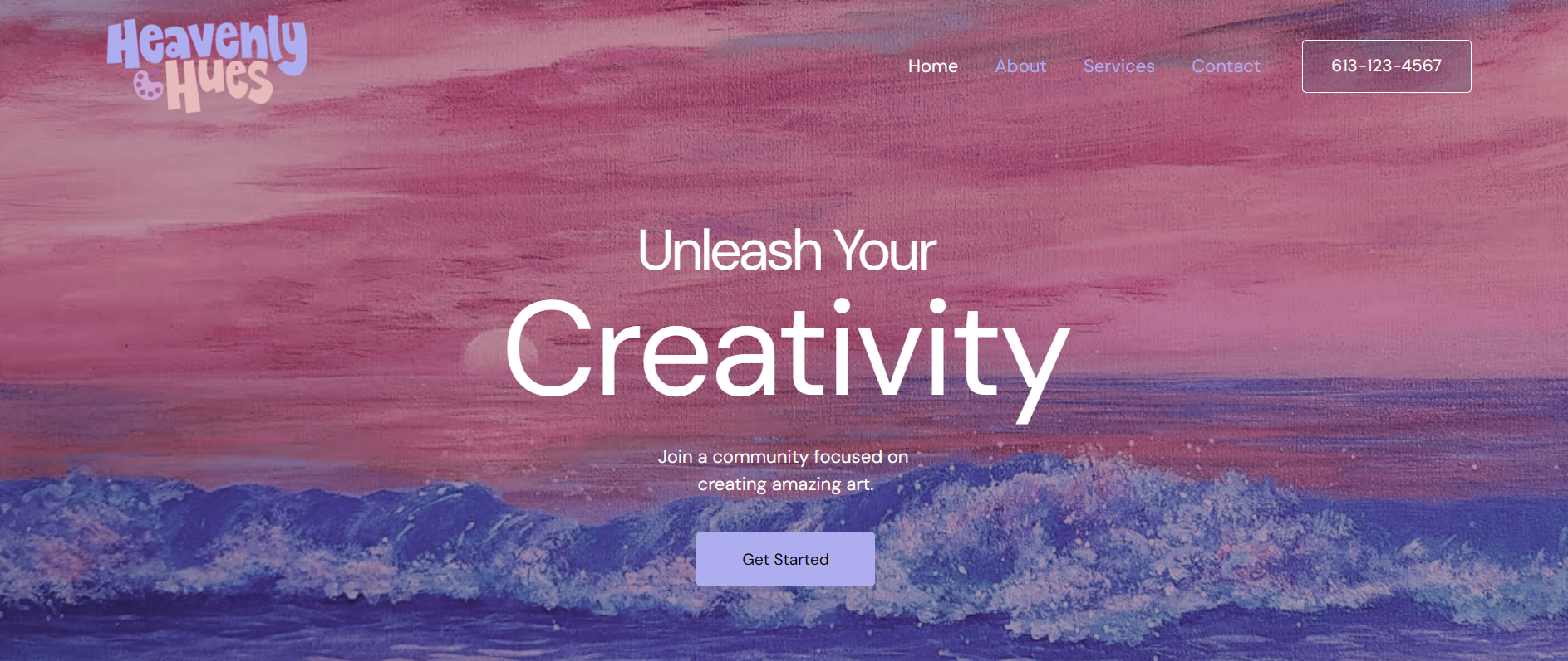


Although this project was for my Content Management Systems course and not specifically focused on logo design, I had a great time creating it! I hand-drew each letter and then traced them using the pen tool in Adobe Illustrator to create clean vector graphics. Using the chosen color palette, I developed both light and dark versions of the logo to ensure optimal readability across different backgrounds.
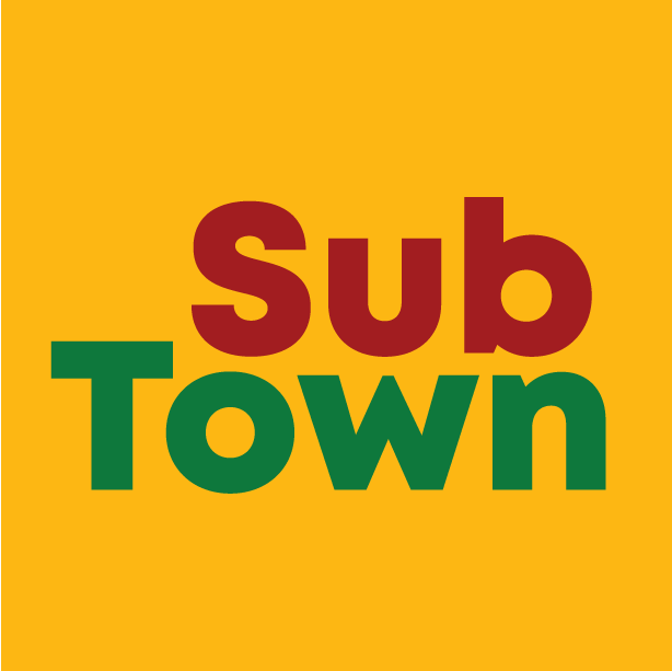
SubTown

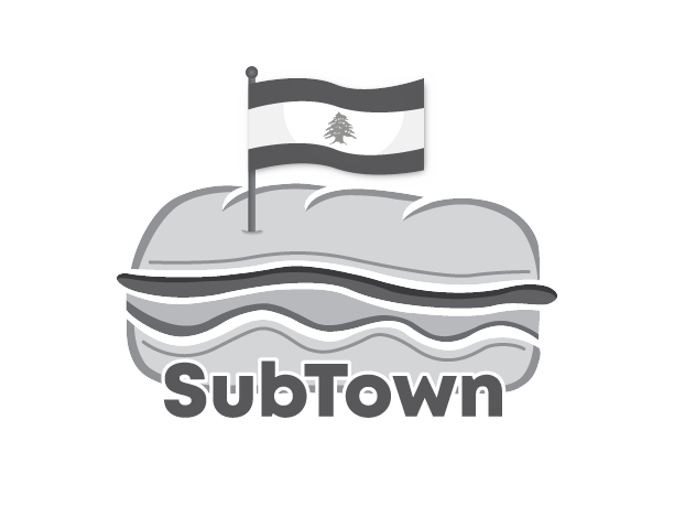
This logo was created for my Media Project Planning course, where we were tasked with reinventing a website of our choice. Through ongoing collaboration with my client (my professor), we developed a logo that combines elements of sub sandwiches with Lebanese culture. Additionally, I designed wireframes for the website, which can be viewed on the 'UX Design' page.
TUD Fashion Society
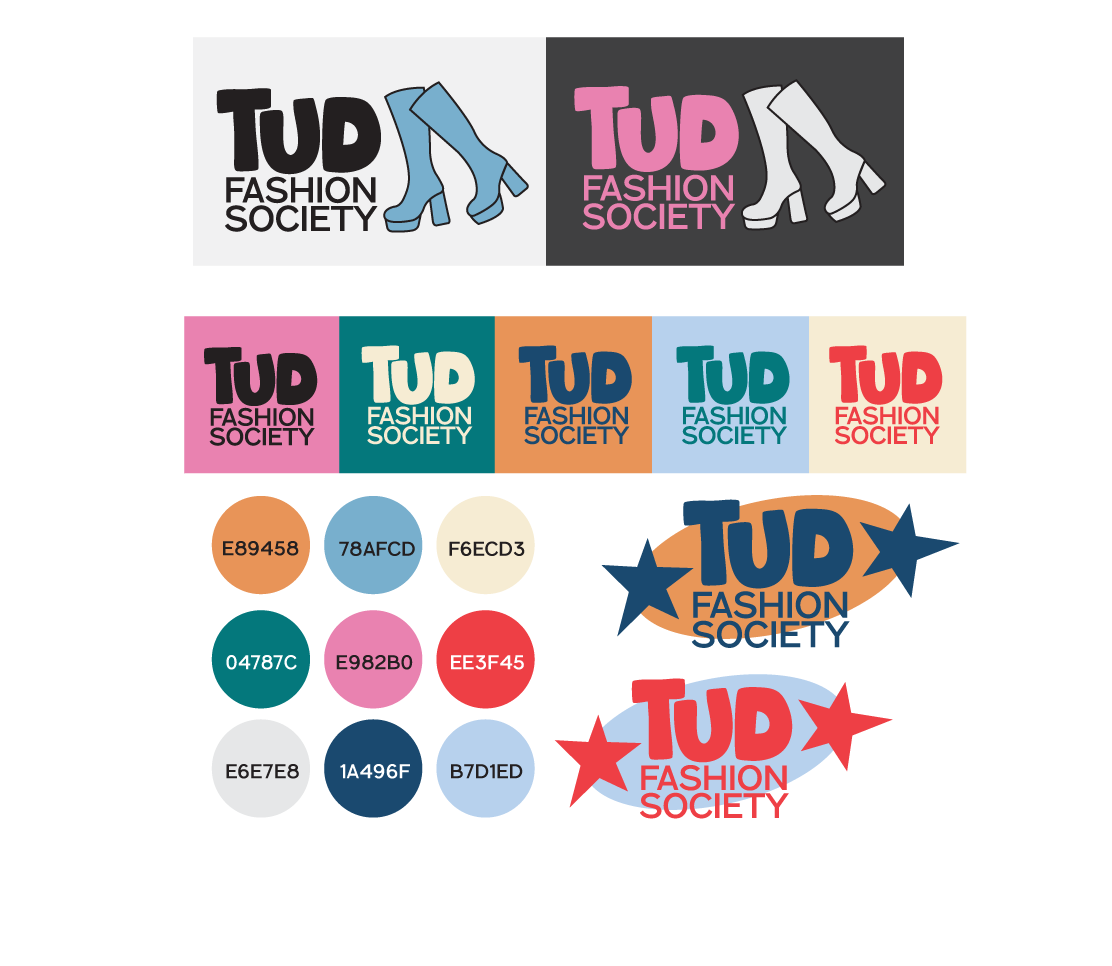
For the TUD Fashion Society in Dublin, I developed a complete brand package that captures the energy and creativity of the student fashion scene. The package includes multiple logo variations designed for flexibility across digital and print formats, as well as a curated colour palette that reflects both modern style and the society’s vibrant, inclusive spirit. The visual identity is bold yet polished, giving the Fashion Society a cohesive and professional look that can grow with their events, collaborations, and campaigns.